Budget Friendly Neutral Living Room

 
image.jpeg

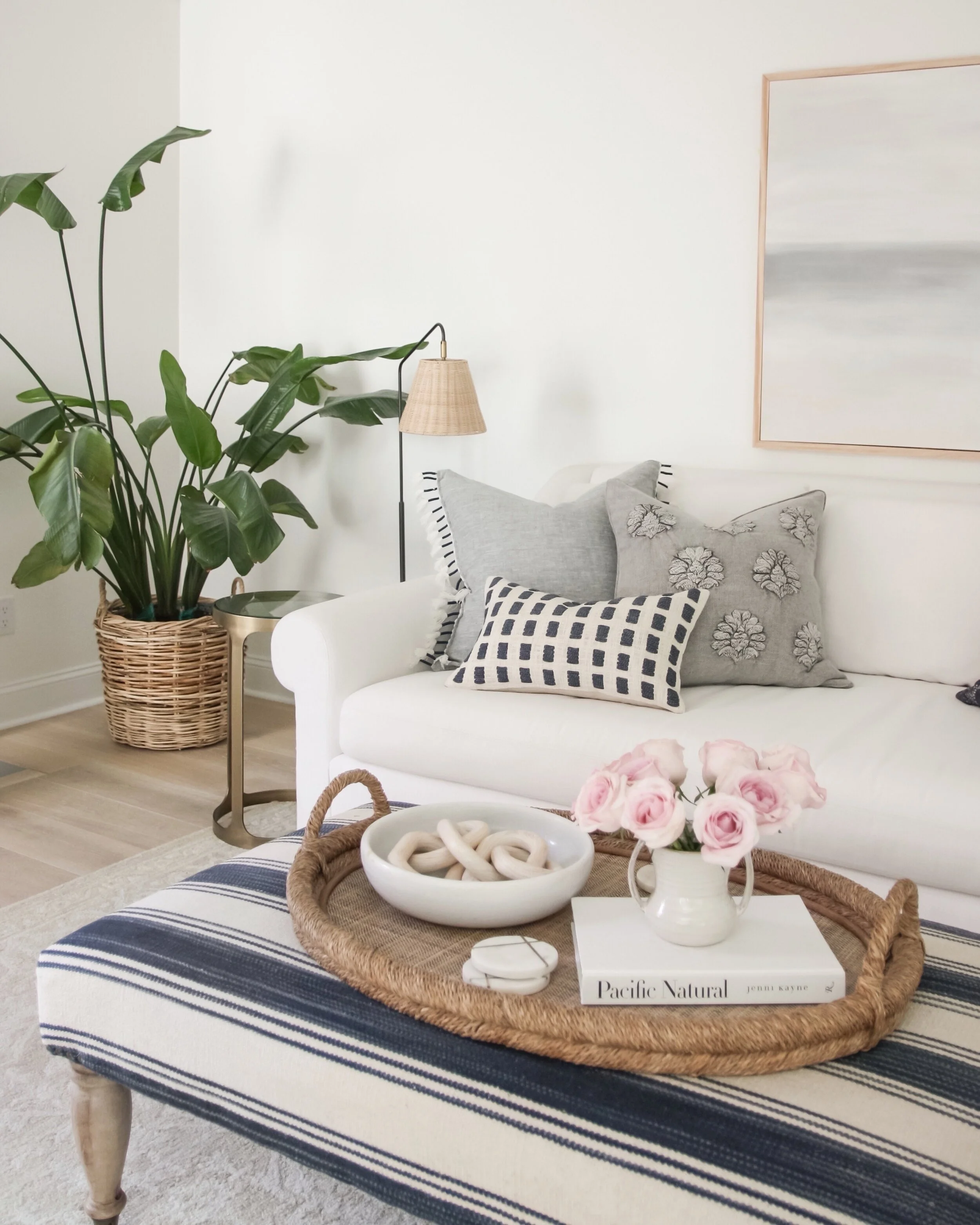
Today I’m sharing a budget friendly living room design. I haven’t done an affordable full room design for a while, and I know a lot of you enjoy when I share boards like this, so I’m going to make an effort to share more affordable whole room designs in the future!


Weekend Style: Neutral Children's Bedroom

 
IMG_3426.JPEG

Today on the blog I’m sharing a neutral children’s bedroom design. I realize I haven’t shared a lot of designs geared towards children’s spaces lately, and I know many of you find this type of content helpful. More and more in recent years I’ve been getting requests for neutral children’s spaces, and I think it does really help the design last a bit longer, and can better transition into new phases of life.

Neutral Children's Bedroom Pinterest.jpg


My Serena & Lily Tent Sale Picks

 
6F80F17B-E53F-4AEA-BF15-47F30000CFEB.JPEG

The Serena and Lily tent sale is on, and there are so many beautiful pieces at great prices! Today on the blog, I’m rounding up a few of my top picks from the sale—which includes some items we have in our home that we love!

Serena and Lily Tent Sale Pinterest.jpg
 

DIY Vertical Shiplap Tutorial + How To Make Your DIY Projects Look More Professional

 
IMG_2721.JPG

I love the texture and dimension that shiplap adds to a space, and have added it to many rooms in our home over the past three years. Today, I’m sharing a tutorial of how I installed this vertical shiplap accent wall in our bedroom, along with my tips and tricks to make sure your diy projects have a more professional looking finished result. I am by no means a carpenter, but I can easily spot bad craftsmanship and finish work when I see it, and I feel that it actually takes away from the space and can unfortunately cheapen the overall look.

AADBA534-4135-440B-AEAC-01E9B05898D1.JPEG

In my opinion, the goal of diying something is to achieve a professional (or near professional) looking result that guests and potential future buyers in your home will not immediately assume was diyed by a non-professional. In each step of this tutorial, I’m going to share just a few simple tips on how to achieve better results for your projects, that make a huge difference in the finished product.

1F5E450C-B15A-4BC2-94CC-2944761136C2.JPEG

Materials you’ll need:

Shiplap

1/4” Plywood

Miter Saw

Table Saw

Jig Saw

Brad Nailer

Air Compressor

Stud Finder

Level

Wood Filler

Caulk

Installing vertical shiplap is slightly trickier than installing horizontal shiplap, because you’ll need to accommodate for the fact that many of your shiplap boards will need to be anchored to the wall between studs. Many people choose to use liquid nails and glue them to the wall, which is a perfectly fine solution. Since I was working with a very long wall I wanted to come up with a solution that was structurally sound, but would not destroy the drywall if anyone decided to remove the wall treatment in the future.

I decided to purchase a 4x8’ sheet of 1/4” plywood, and have the hardware store rip it down into 4” strips. That way, I could use them to create a structure behind the shiplap that was mounted to all of the studs and would minimize the damage to the wall. I will share more details and images of how I did this below.

Step 1:

I removed all the baseboards on the wall first. This is my first tip to a professional looking result! DO NOT leave on your baseboards or crown moulding and install your wall treatment over top, or try to miter the boards to tie them in. This never leads to a professional result, and is an immediate indicator that your project was not done by a professional. Always remove all baseboards and mouldings before installing a wall treatment. It is an easy (and free) additional step you can take that does not require any additional skills. After I removed all the mouldings, I used my stud finder to find where all the studs were, and used my level and a sharpie to make sure I marked them from the floor to ceiling.

IMG_8783.jpeg

Step 2:

This is where my 1/4” plywood structure comes into play. I made a plan in photoshop before heading to the hardware store to make sure I knew how much wood I needed, and what size strips I should have them ripped to. I figured out that one 4x8’ sheet of plywood ripped into 4” strips would provide enough materials to complete my structure. I also calculated how much shiplap I’d need for the project.

Another tip for professional looking shiplap—use products that are actual shiplap, or tongue and groove. Do not rip down plywood, as it is very prone to splintering on the edges, and has knots and texture in the finish of the wood, which will all lead to a very unprofessional looking paint job. I know it’s tempting to use these materials since they are very cost effective, but it’s not too much more to use higher quality materials like real shiplap, and they give you a significantly better finished product.

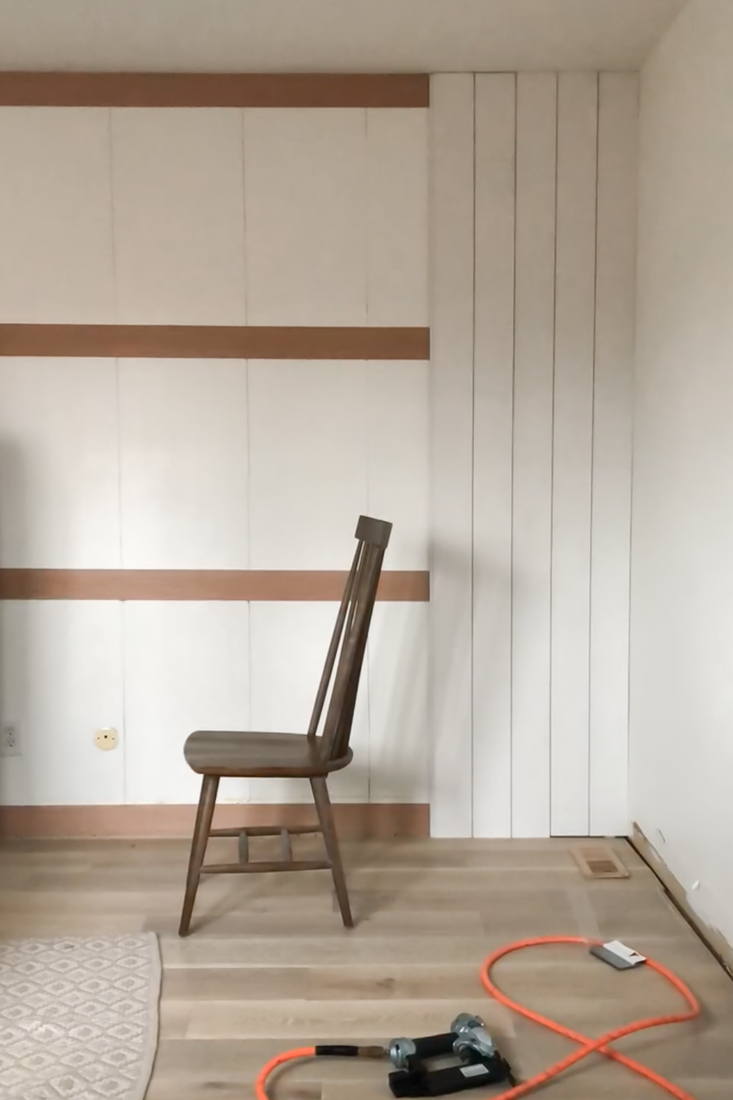
I attached the 1/4” plywood strips to the wall horizontally in four places so that I could nail the vertical shiplap boards over top and they would be secure enough to hang artwork on if I chose to do so. Every board would be anchored securely, and I was not damaging my drywall as much as if I were using liquid nails.

Step 3:

I then started attaching the vertical shiplap boards to my 1/4” plywood structure. I knew the cuts didn’t need to be exact since the baseboard would be covering up the bottom, so I cut them all at once and then installed them making sure I got the top of the board as flush to the ceiling as possible to minimize caulking later. Tip—make sure to place nail holes in spots on the boards that will be covered with baseboard or crown moulding wherever possible. This way you can minimize wood filling and reduce the amount of finish work you need to do, which will create less imperfections in the visible portions of the wall treatment.

Step 4:

Once you have all the vertical shiplap installed, reinstall the baseboard and crown (if applicable) and fill in all the nail holes, and caulk all the edges. Tip—make sure you do not skip this step! This is the key to a professional result. Gaps, cracks, and nails holes will detract from the wall treatment, and cheapen the overall look. The more seamlessly your new wall treatment blends into the wall, the more professional it makes the space look, and the more elevated it will make any furniture and decor you add appear. Make sure you caulk along top and bottom edges of the shiplap to seamlessly blend the ends of the boards into the ceiling (or crown moulding) and baseboard. I use a q tip or screwdriver to remove excess caulk from the grooves of the shiplap. This step is time consuming, but well worth it, and can make or break the project if you choose to skip it.

Tip—when cutting around outlets make sure to allow room for the outlet to be extended out flush with the new wall treatment. We like to use these outlet extenders to do so. DO NOT cut the shiplap around the existing outlet and cover and leave inset as the original depth of the wall. This is another opportunity to attract unwanted attention and leave your project looking unprofessional.

Step 5:

Sand all the wood filler, and paint the shiplap and mouldings in your desired color.

96B0840D-D906-44C9-B8F3-41D3A17999EB.JPEG

That’s it! Shiplap is one of the easiest diy projects I’ve completed, and can really transform your space to give you a more elevated look with a fairly low materials cost. I also hope the tips and tricks I shared help you to complete more professional looking projects in the future!

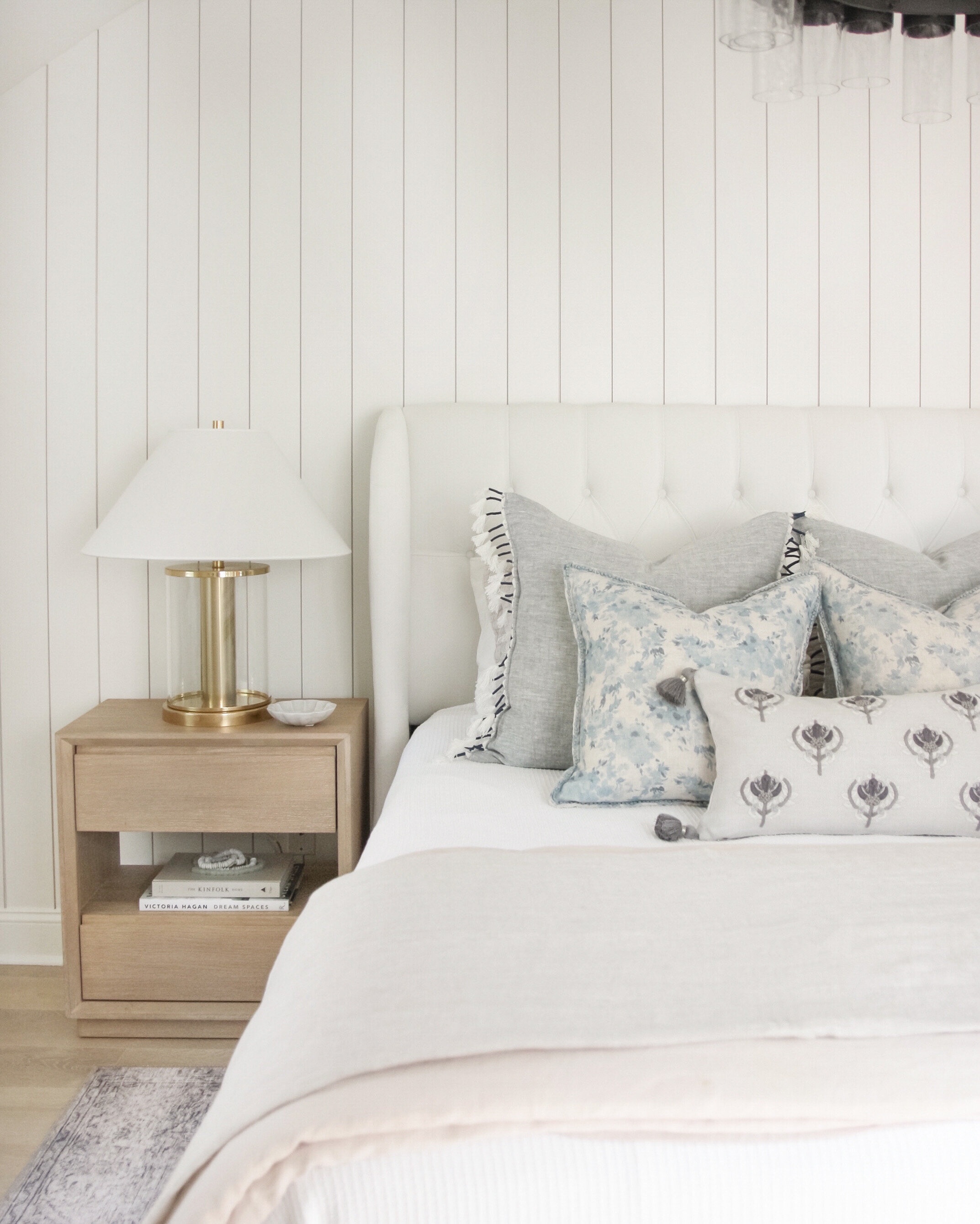
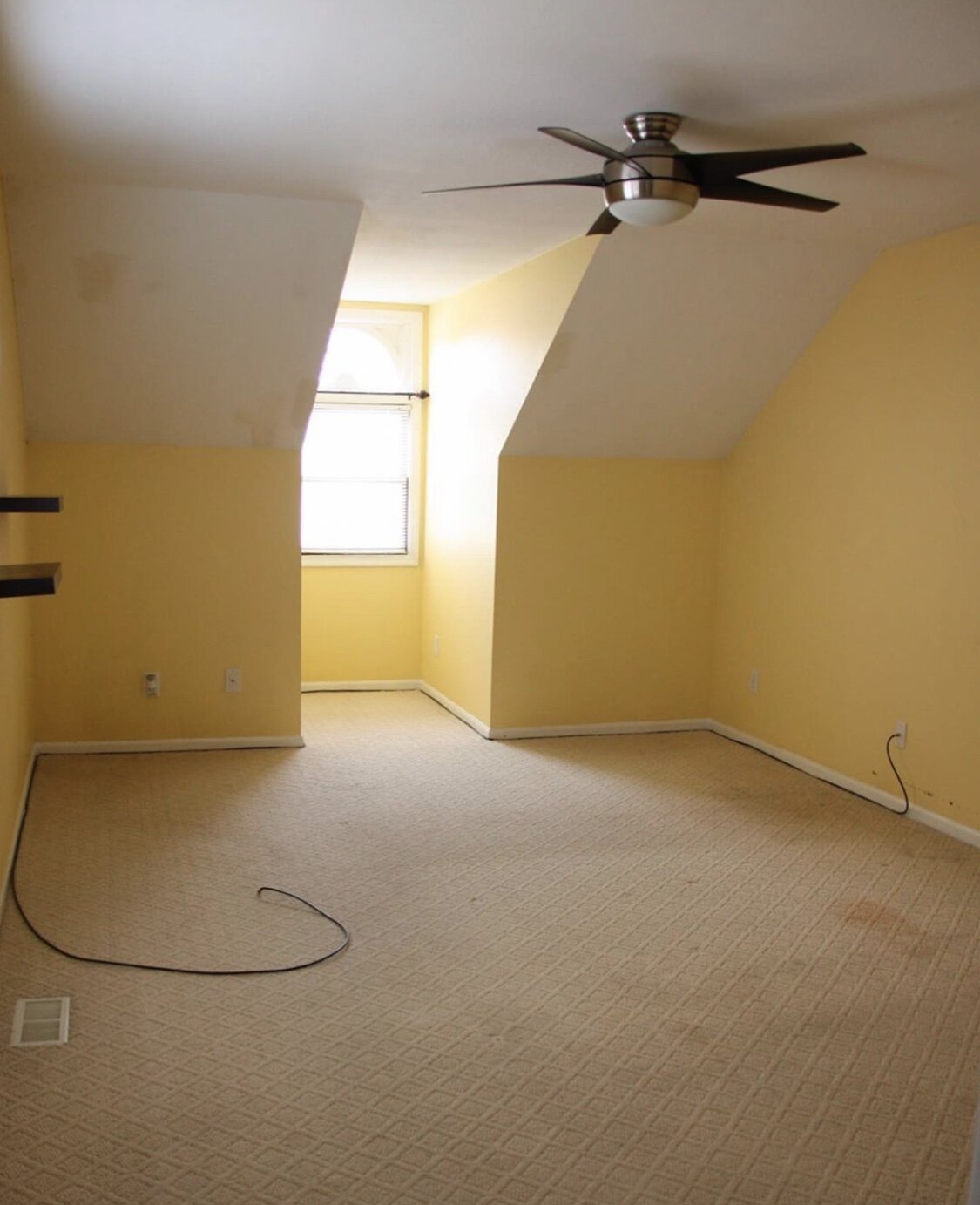
In case anyone is new around here, I’m going to add a before and after of our bedroom below so you can see where we started! This project was the perfect finishing touch to our space, and really helps pull some dimension into this all white space.

And here’s a before and after of the wall before I installed the shiplap last year, and how it looks today!

Sources:

DIY Vertical Shiplap Pinterest Image.jpg
 

Your Favorites This Week

 
image-1.JPG

I hope you all had a wonderful holiday! We had a nice time relaxing with my parents and spent a lot of the day finishing up a bathroom renovation we’ve been helping them with. I can’t wait to share with you all soon! Today I’ve rounded up some of your recent favorite items and will share them below!


Independence Day Sales

 
2A8BD6E3-20C5-4F7D-915B-83164D6C25DF.JPEG

I can’t believe that it’s almost the fourth of July! Without a lot of the things we’d normally be doing this time of year, the holiday really snuck up on me. I’m looking forward to an extra day to relax this weekend and some great sales to shop online! Today I’m rounding up all of my favorites along with a few of my picks. I hope you all have a nice holiday!

Serena & Lily — Special pricing on all outdoor items

Target — Save up to 25% off home items, women’s clothing starting at $5

Pottery Barn — Buy more save more, up to 25% off

Wayfair — Up to 70% off

Abercrombie — 40-60% off the entire store

McGee and Co — 20% off select lighting

Rejuvenation — 20% off everything

Madewell — Extra 30% off sale

West Elm — 20% off furniture, 25% off everything else

Anthropologie — Up to 70% off original prices

Lulu & Georgia — 20% off everything

Crate & Barrel — Up to 30% off sitewide

World Market — Up to 50% off storewide

Overstock — Up to 70% off 1000’s of items

American Eagle — Up to 60% off everything

Bloomist — $20 off $100 or more

Williams-Sonoma — 25% off your order

Wisteria — Going out of business sale, everything at least 50% off


Bed Styling Four Ways

 
CE431CBB-5FDD-41AE-82D8-E92A7161A9D9.JPEG

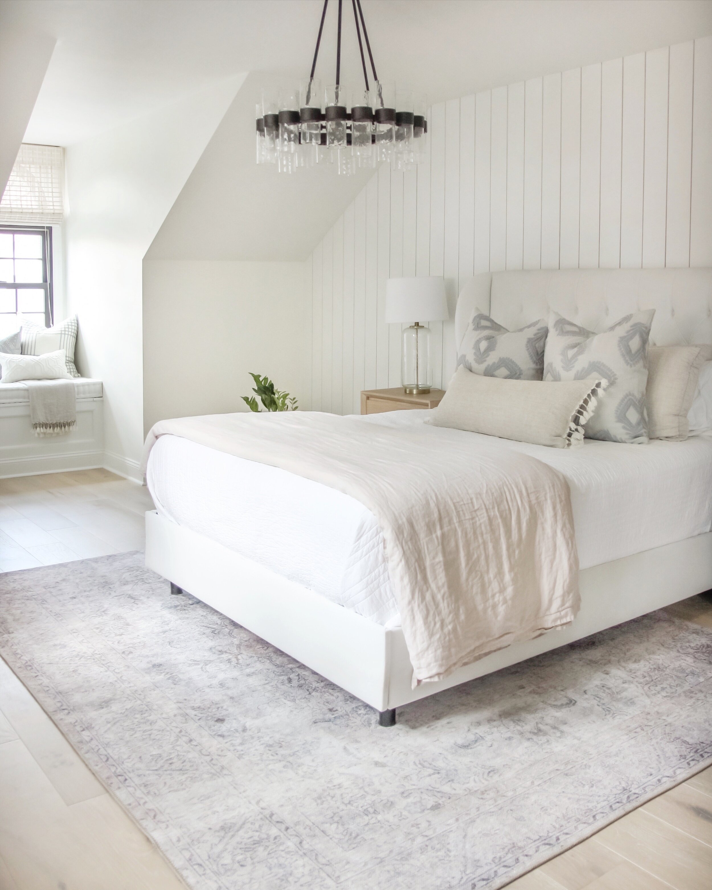
As you may have already noticed, beds are one of my favorite things to style, and is one of the few items I allow myself to collect! I love changing up the way my bed is styled seasonally, which sometimes doesn’t mean that you need to spend more money. Just changing the way a duvet or quilt is folded or situated on the bed makes a big difference and can provide a fresh new feel to your bedding.

Today, I’m sharing four ways to style your bed with simple tweaks here and there. You will notice that some items repeat throughout the looks, even though the looks themselves are quite different. I love doing a cohesive color palette throughout my whole home, because that way I can mix and match pillows and accessories between rooms to refresh my spaces without spending anything!

Bed Styling Four Ways.jpg

Textural

For the textural look I’ve brought in a collection of different sized pillows onto the bed to create a more inviting feel. The pillows I’ve chosen are also more casual in style, and have a lot of fringe and woven details to them, which I always find make a space feel warm and inviting. Texture is an important element not to overlook when designing very neutral spaces, as it provides more depth and character to the design. I’ve finished out the styling with a woven linen throw at the foot of the bed over the folded duvet, and a faux concrete table lamp to keep the touches of gray evenly dispersed throughout the space.

CE431CBB-5FDD-41AE-82D8-E92A7161A9D9.JPEG

Minimal

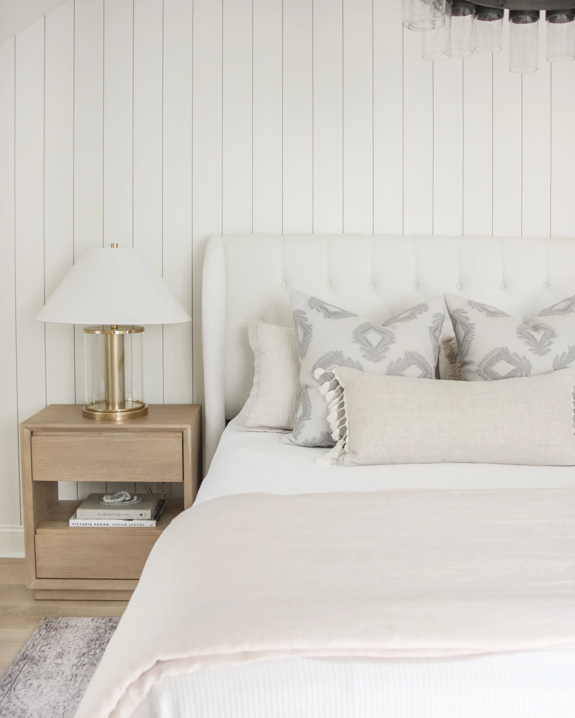
I’ve paired things down in the minimal look, sticking to three decorative pillows and keeping only the duvet folded at the foot of the bed. I’ve kept the nightstand to mostly functional pieces, with two coffee table books and decorative beads in the open shelf to add a bit of personality. There’s just enough in this vignette to make the bed feel inviting but not overdone.

AADBA534-4135-440B-AEAC-01E9B05898D1.JPEG

Layered

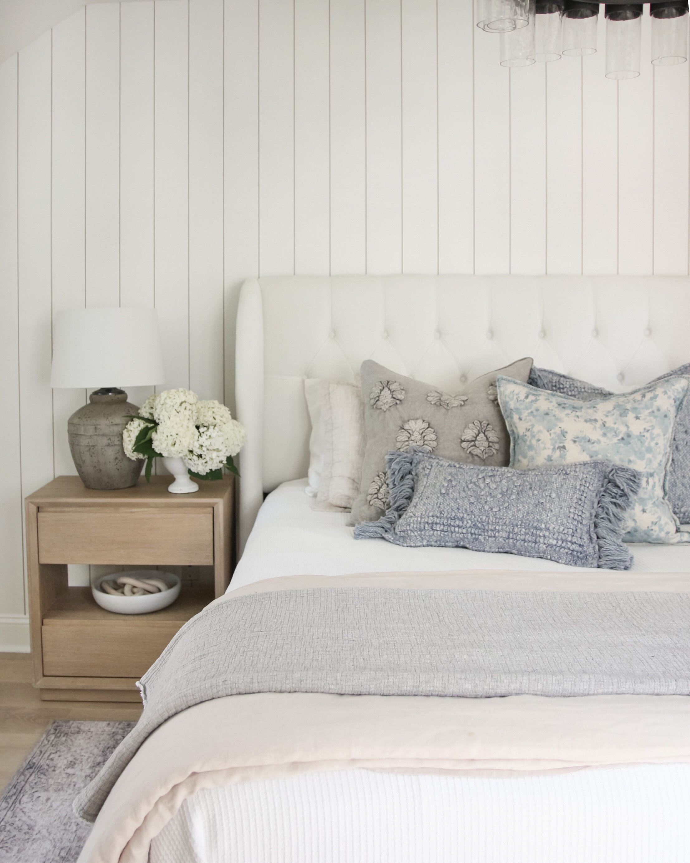
To create a layered look, I’ve added in five pillows to the bed, pulling in more texture, pattern, and color. I’ve brought in some additional decor to the nightstand, and have added in an oversized linen throw to the foot of the bed.

1F5E450C-B15A-4BC2-94CC-2944761136C2.JPEG

Monochromatic

For the final look, I’ve done a monochromatic look that creates a light and airy feel for the space. Since there isn’t much color here, I’ve made sure the pillows have some texture to them. The plaid pillows are a very substantial wool that have a soft and fuzzy feel, and the lumbar pillow has the gray embroidered detail that draws the eye to the center of the bed, making these two patterns the focal point. I’ve added in the brass lamp for a warm and polished touch, and made sure all of the white linens on the bed had plenty of texture to keep the space feeling inviting and not sterile.

IMG_3133.JPG

A couple weeks ago I shared a dresser styling post on instagram that is a nice compliment to these bed styling techniques. I will be sharing a full post on the details of how I style a dresser soon!

Dresser Styling Four Ways copy.jpg
 

Accent Tables Under $300

 
image.JPG

It’s been a while since I’ve done a fresh roundup of affordable accent tables, and since this is such a key item in many spaces in a home I’m sharing a ton of new options today! I’ve kept the list to light neutrals with some subtle textures and warmth that are great for a large range of design styles.

BB Affordable Accent Tables Under 300 916 copy.jpg


Target x Studio McGee Restock


As I was browsing Target this afternoon I realized that there were a lot more Studio McGee pieces that have come back in stock since they launched the collection a couple months ago. If there are any pieces you had your eye on, it’s worth a look to see if they’ve popped back in stock today!


Weekend Style: Warm Neutral Office

 
Weekend Style Office (June).jpg


My Favorite Nature-Inspired Color Palettes: How I Translate Them To Interiors


Muted Blues and Light Natural Textures

Color Palettes 1 copy.jpg

Inspiration image via


Soft Beige and Textured Whites, with Touches of Muted Green

Color Palettes 2.jpg

Inspiration image via


Beige/Blush Tones, Mauve, and Rich Textural Wood

Color Palettes 3.jpg

Inspiration image via


Welcoming Summer with Serena & Lily

 
3C0E03FF-440C-4BDA-88F0-404569A6FA95.JPEG

It’s officially summer! After what feels like the longest spring I can remember, I am very ready to take advantage of the longest, sunniest days of the year. We’ve been spending a lot more time enjoying the season in our backyard, and just added another summer essential to the space—some Serena & Lily beach towels. We love how oversized they are, as well as how soft and plush, making them a great addition for laying on our deck on warm and sunny days under the shade of our Japanese maple tree. We have the Capri Fouta Beach Towel in Pewter, and I love the varied stripe pattern and subtle coastal feel the neutral tones provide. I can also see our new towels coming in handy even to use as a throw for when it gets chilly at night, or to lay out in the grass if we want to have a picnic in our nearby park.

2A8BD6E3-20C5-4F7D-915B-83164D6C25DF.JPEG

Summer never used to be my favorite season as a kid, but as an adult it’s quickly become the season I look forward to most all year. I feel extra grateful for it this year especially, and have been enjoying going on long walks every evening and the extra time I get to spend with my family members. The next activity up on our list is to have a family slideshow in our backyard, along with possibly a few movie nights once we get a projector.

Serena and Lily is known for their classic style and the relaxing costal feel that their products provide, and the more pieces of theirs that I incorporate into to my home over the years, the more they’ve become one of my very favorite brands. During the last few months I’ve made a lot of realizations about my home, and how exactly I want and need it to feel to keep me relaxed, happy, and comfortable. I know I can find all of those aspects in anything I find at Serena and Lily.

IMG_2982.JPG

Aside from our fun new beach towels, I’ve also rounded up some more pieces that would make great summer additions to your home to help enjoy the season.

SL Solstice.jpg


Bath Mat Roundup

 
IMG_2970.JPEG

A bath mat is a necessary functional piece of a bathroom, but that doesn’t mean that it can’t be beautiful as well. Today I’ve rounded up a few neutral bath mats that would add the perfect touch of color and personality to any space. I’ve sourced a variety of runners and mats to work with double or single vanities, or even in front of bathtubs or showers.


Bath Mats Small.jpg


Weekend Style: Library

 
Weekend Style Library.jpg


My Latest Decor Finds

 
My Latest Decor Finds.jpg


Sconce Roundup


More options…


Weekend Style: Family Room

 
BB Weekend Styling Family Room.jpg


Summer Living and Dining Room Updates with Serena and Lily


I haven’t made any changes to our living room or dining room for the last year or so, and recently I decided to give them a bit of a refresh. We’ve been spending even more time than usual in these spaces over the last few months, and it felt like the right time to give these spaces some attention and breathe new life into our surroundings.

3BD4B661-E798-41D3-998A-B07989D27FA1.JPEG

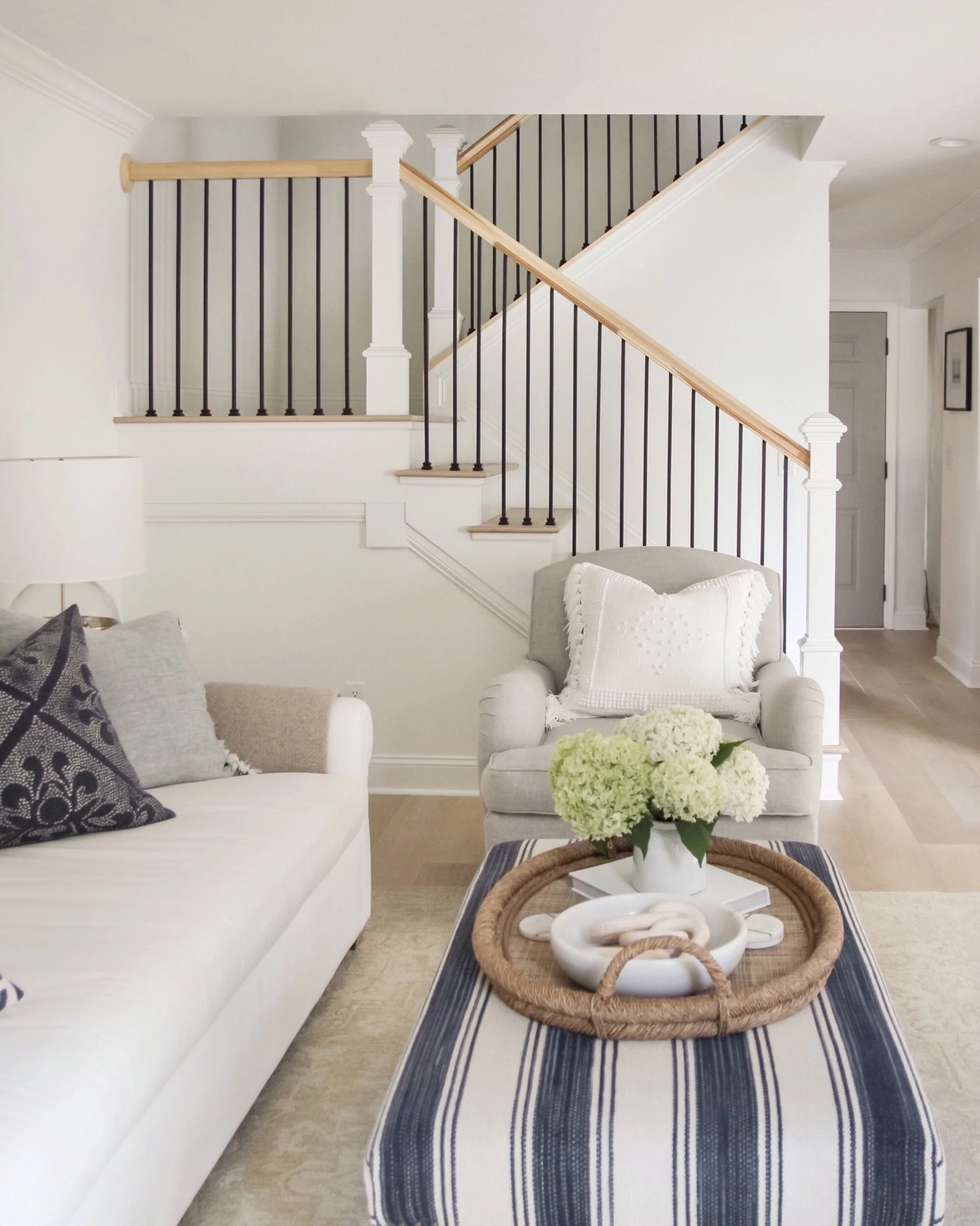
My main focus was to do a complete pillow update in both spaces. I like to keep the main furniture pieces neutral and classic, and add in touches of color, pattern, and personality in with the pillows and accessories. I wanted a fresh and calming feel for the space, so I decided to stick with more of a monochromatic palette. I’ve always strived to create spaces that have a calming feel, but now more than ever I feel as though I really need my spaces to be as peaceful as possible. Whenever I think of calming designs, I always think of Serena and Lily, so I started the refresh process by exploring their inspiration page. Then, I created a mood board for the space, which you’ll find below.

SL Design Update.jpg

I’ve had my eye on the Topanga Pillow for a long time now, and opted for the pretty muted blue color. I fell in love with their new Miramonte Pillow in the smoke color, and it the texture is so beautiful in person! I’m kind of wishing I could use it in more colors in other rooms in our home. I wanted to tie in a bit of the navy from our ottoman, so I then added in the Pebble Cove Pillow in the lumbar in the ivory/navy, and the Camilla Scroll Pillow in the indigo. This gave me just the right amount of contrast in the space, and tied in the ottoman perfectly. The Pebble Cove pillow is another one that photos just cannot do justice to. The texture and warm ivory and navy tones add so much depth and sophistication to the space. Lastly, I wanted to brighten up the english roll arm chair, so I brought in the Montecito pillow cover in ivory. We have this in the coastal blue in our bedroom, and I love the texture of it so much I decided to add it into the living room as well. I also painted a new piece of oversized abstract artwork to brighten the space, which I will share more about later.

image.jpeg

I’ve always kept the dining room pretty minimal, but wanted to update the pillows here as well. I brought in two of the Somerset pillow covers in blue and love the vintage style English inspired pattern and French knot hand embroidered border. Another piece that’s more stunning in person than photos can reflect.

9F0756F3-F60B-4E0E-A9F7-7F18EA3F9CE6.JPEG

I finished out the new look with the Pinecrest Side Table since we were wanting a bit more storage in the space. My husband sits on this side of the sofa every evening, and he loves the small drawer to hold all of his current books, and the pull out shelf above the drawer is great for setting a drink on. I also updated the table lamp to the Maybrook Lamp, because I love the classic style and the dimming feature on the switch. It’s the perfect touch of refinement and function. We have the Midbrook Table Lamp in our master bedroom, and while I absolutely love the look, the dimming function on the lamp is what brought me back for another of its kind. On the opposite side of the sofa I brought in another touch of brass with the Piedmont Martini Table. Lastly, to finish out the styling, I’ve added in the Milo Alpaca Throw in the oatmeal to layer in some softness and texture to the space.

image.JPG

Overall, I’m very happy with how these spaces turned out! They make our home feel fresh and tranquil, and this refresh project was a fun distraction that I really needed during this time. I love the relaxed feeling these new pieces bring to our home, and we’re both looking forward to enjoying these new spaces.

*This post is in partnership with Serena and Lily. All opinions are my own.


Etsy Vintage Rug Roundup


Today I’m sharing a roundup of vintage rugs I’ve sourced from Etsy. I love how vintage or vintage style pieces can add character to a space, and really helps give the design a unique look. I’ve been very drawn to the more subtle and faded vintage rugs I’ve seen lately, so today I’ve rounded up a lot of options from medium/large area rugs, to minis and runners that make great accents.

Medium - Large Rugs

Etsy Vintage Rug Roundup.jpg

Minis and Runners

Etsy Vintage Rug Roundup 2.jpg


Target Summer Tops


This week I decided to freshen up my summer tops a bit and ordered a few new styles from Target. I realized lately that the only tops I seem to grab for are my Target ones since they’re so comfortable, but also make me feel put together. Even though I’m still not leaving our house, getting dressed every day and feeling put together has helped so much with my overall mood and productivity. I’m going to link some of the tops that I have and love, some that I just ordered this week, and a few more favorites below.

Spring Target Tops.jpg

A few more favorites…