Before + After Tour: Master Bedroom Transformation
Today I’m sharing some of our recent master bedroom updates, along with a few before and progress photos of the space. I realize I haven’t done any blog posts on the transformation of our home to date, and want to start a series of posts that documents that. We’ve worked really hard over the last few years to transform our home, and a lot of that was done before I had a blog. Looking back, I wish I would have documented certain things a bit better, but I wasn’t planning on having this blog at the time, and tended to get wrapped up in projects and forgot to take progress photos!
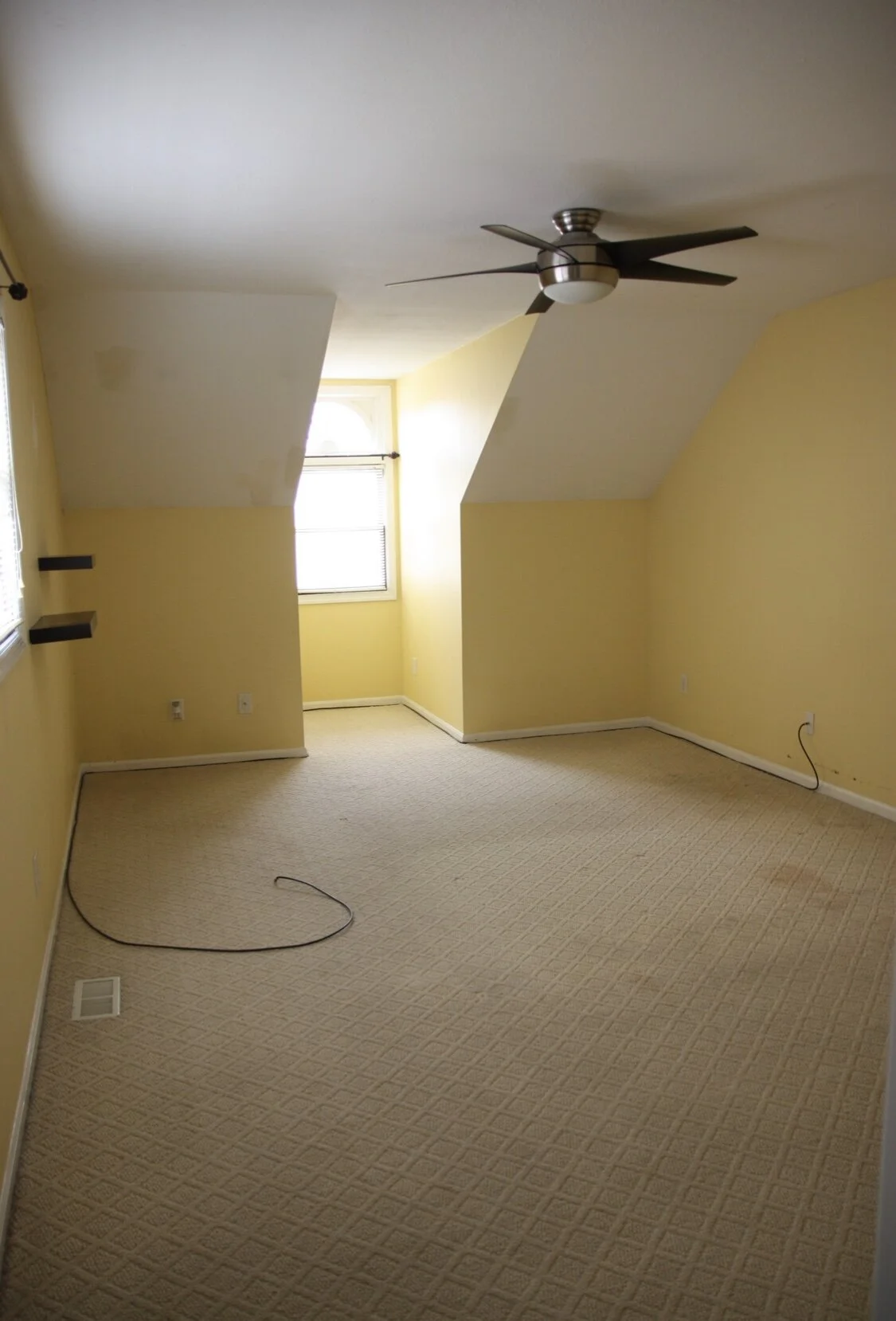
When we bought this house it was in pretty bad shape, though luckily most of it was cosmetic. It was built in 1981, and nothing had been updated except for the master bathroom (which wasn’t done with very high quality craftsmanship or materials, so we will still need to redo almost everything eventually). The yellow paint color and carpet in our bedroom had seen better days, and was in need of a refresh.
The first thing we did in here was remove the carpet and baseboards, and gave the walls a fresh coat of paint (SW Extra White). We then installed new wood flooring and all new windows. Some of these windows had so much moisture between the panes you couldn’t see out of them. They were also extremely leaky, which made our first winter here very cold, since we couldn’t get the new ones installed until early spring.
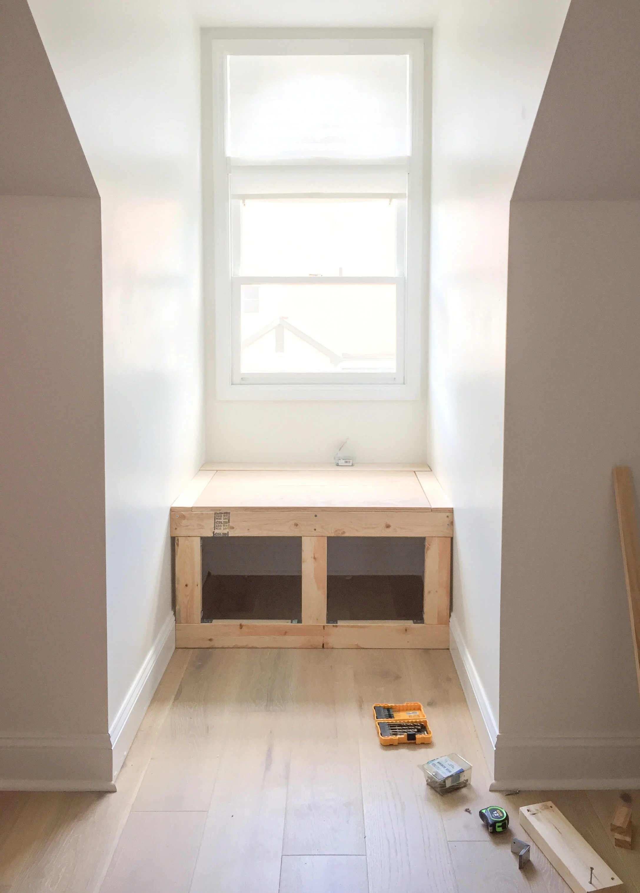
Here are a few mid reno photos. The white paint made such a big difference in this space, and helped the 8ft ceilings to feel higher, especially near the dormer window where they slope down into the knee walls.
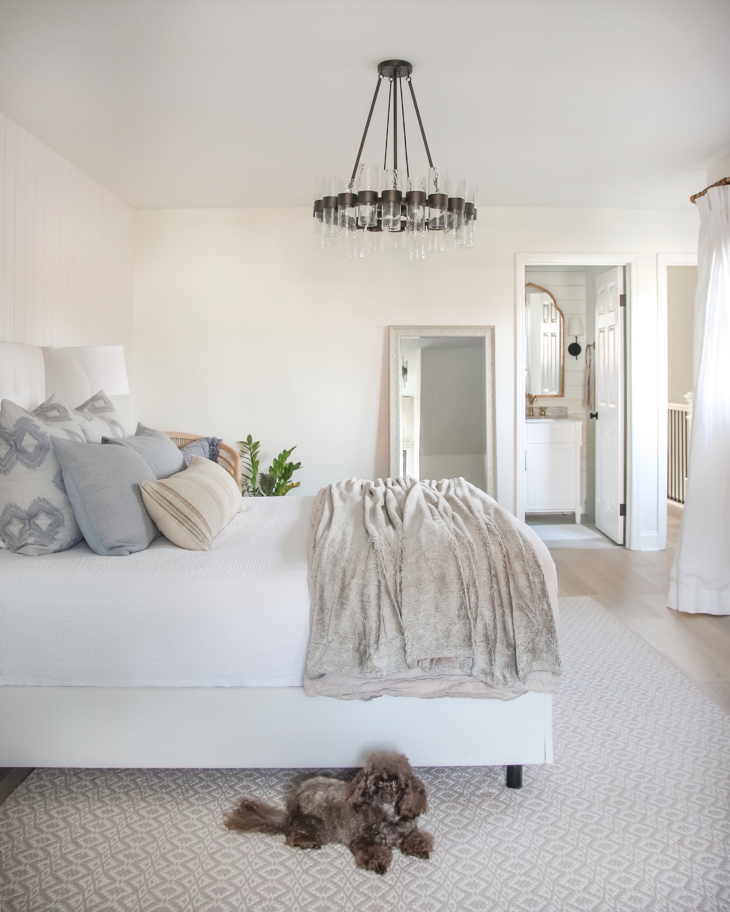
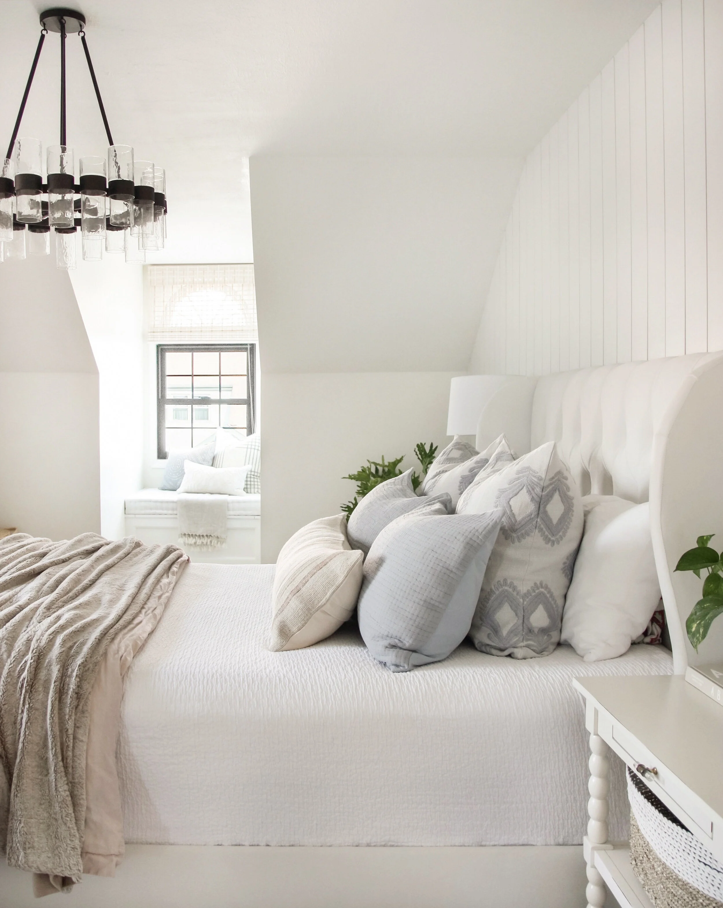
We then installed this light European Oak flooring which also adds to the light and airy feel in this space. To pull more dimension into the all white space, we added in this vertical shiplap accent wall behind the bed last year. We also removed the ceiling fan and replaced it with a chandelier to give the space a more polished feel. We just recently moved the original chandelier to the guest room and upgraded to the Penni Glass Chandelier and the proportions are a bit better for this large space. I love the way the light from the dormer window shines through the bubble glass in this piece and catches your eye as you walk into the space.
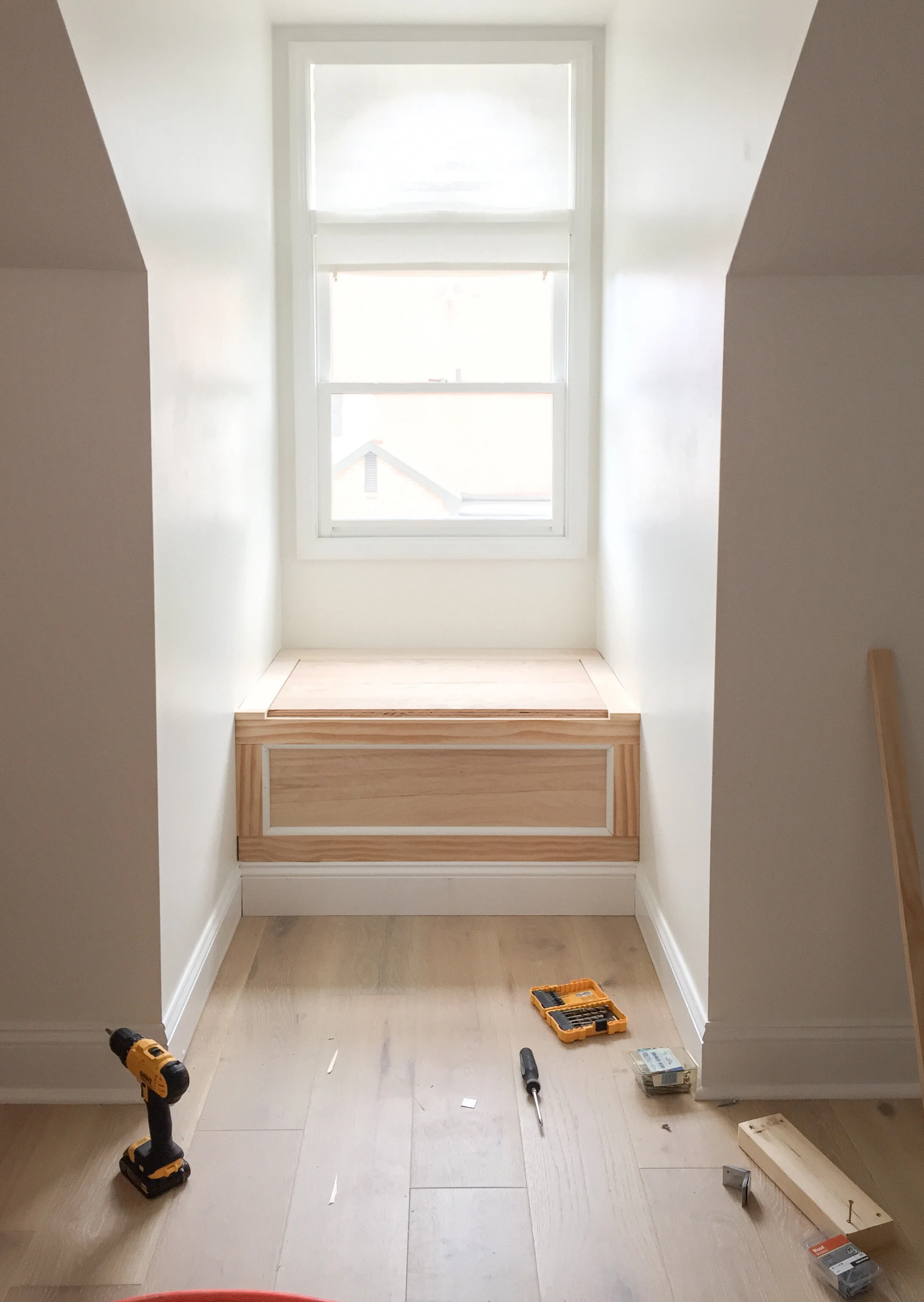
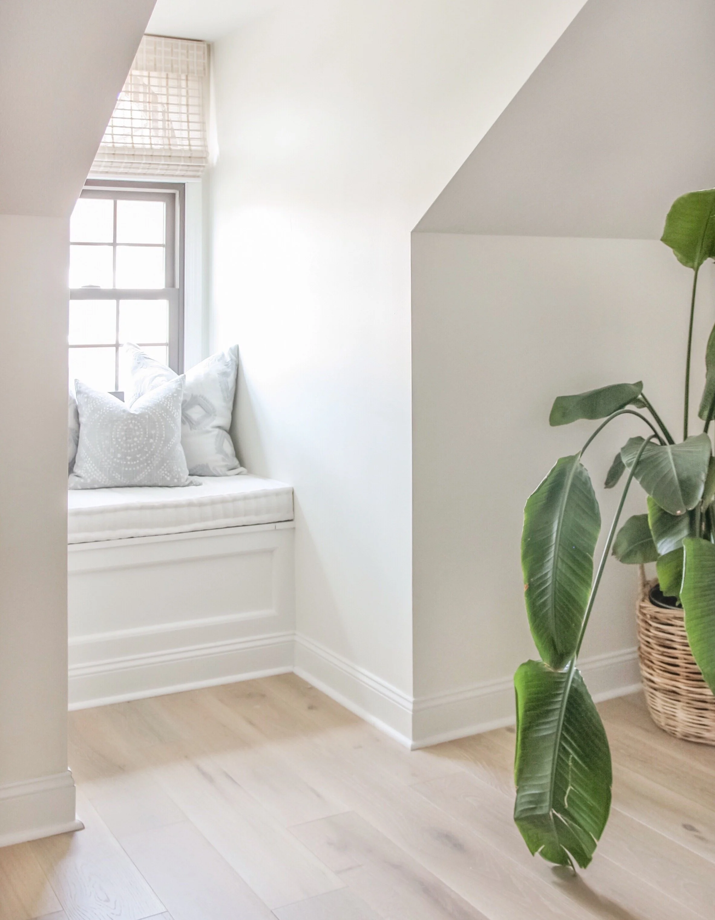
Another addition we made to the space that made a big difference was adding this extra deep window seat into the dormer window. It’s about five feet deep, so we were able to make a super cozy space that gives that area of our room more purpose and adds to the overall relaxing feel in the space.
Overall we are very happy with the way our bedroom has come together over the past few years, and truly enjoy spending time in this space. There are a few more changes I’d like to make in here still—the biggest being a furniture refresh and possibly upgrading to a king size bed. Even if we don’t end up doing anything else in here, I feel grateful to call this space our own. It’s even sweeter to have the fun memories we made while renovating to reflect on every time we walk into the space.

