Before + After Tour: Master Bedroom Transformation
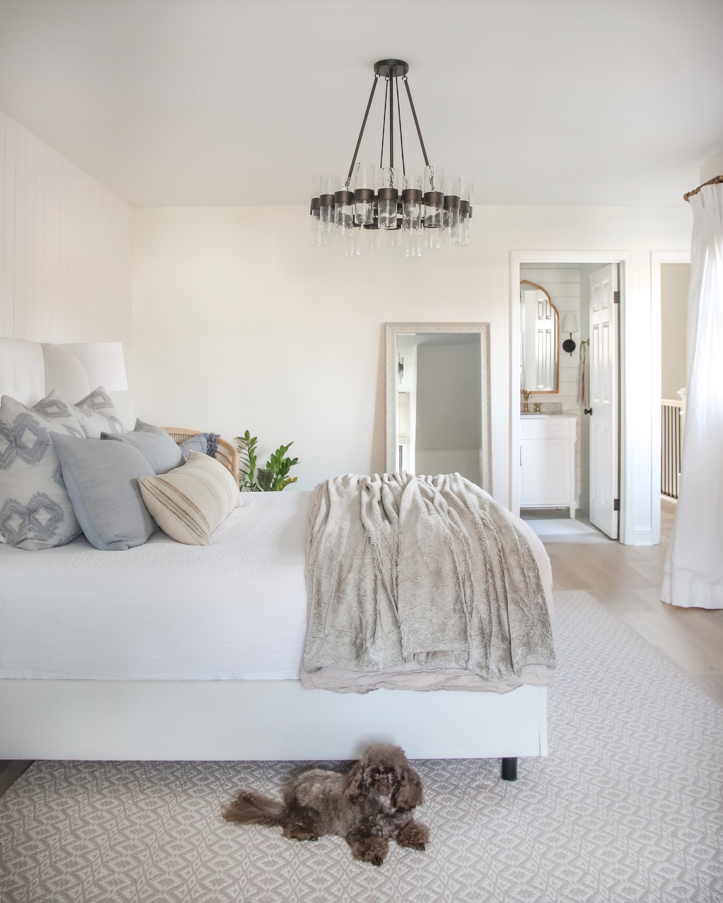
Today I’m sharing some of our recent master bedroom updates, along with a few before and progress photos of the space. I realize I haven’t done any blog posts on the transformation of our home to date, and want to start a series of posts that documents that. We’ve worked really hard over the last few years to transform our home, and a lot of that was done before I had a blog. Looking back, I wish I would have documented certain things a bit better, but I wasn’t planning on having this blog at the time, and tended to get wrapped up in projects and forgot to take progress photos!
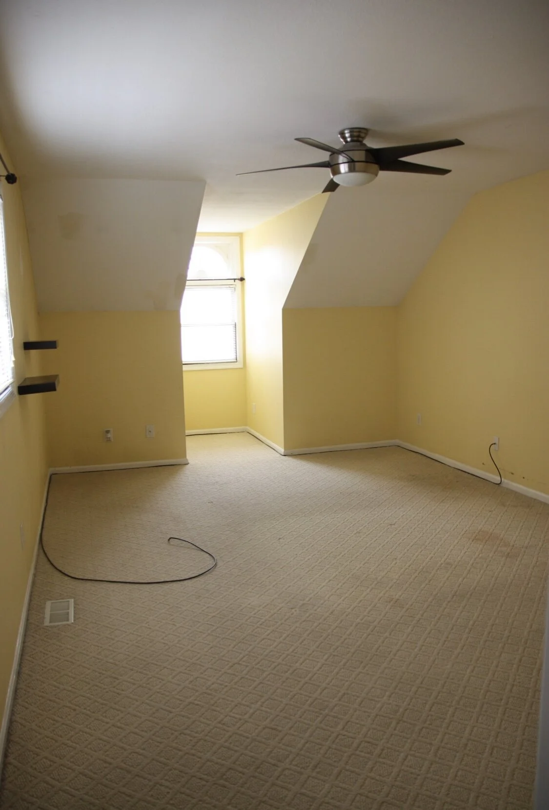
When we bought this house it was in pretty bad shape, though luckily most of it was cosmetic. It was built in 1981, and nothing had been updated except for the master bathroom (which wasn’t done with very high quality craftsmanship or materials, so we will still need to redo almost everything eventually). The yellow paint color and carpet in our bedroom had seen better days, and was in need of a refresh.
The first thing we did in here was remove the carpet and baseboards, and gave the walls a fresh coat of paint (SW Extra White). We then installed new wood flooring and all new windows. Some of these windows had so much moisture between the panes you couldn’t see out of them. They were also extremely leaky, which made our first winter here very cold, since we couldn’t get the new ones installed until early spring.
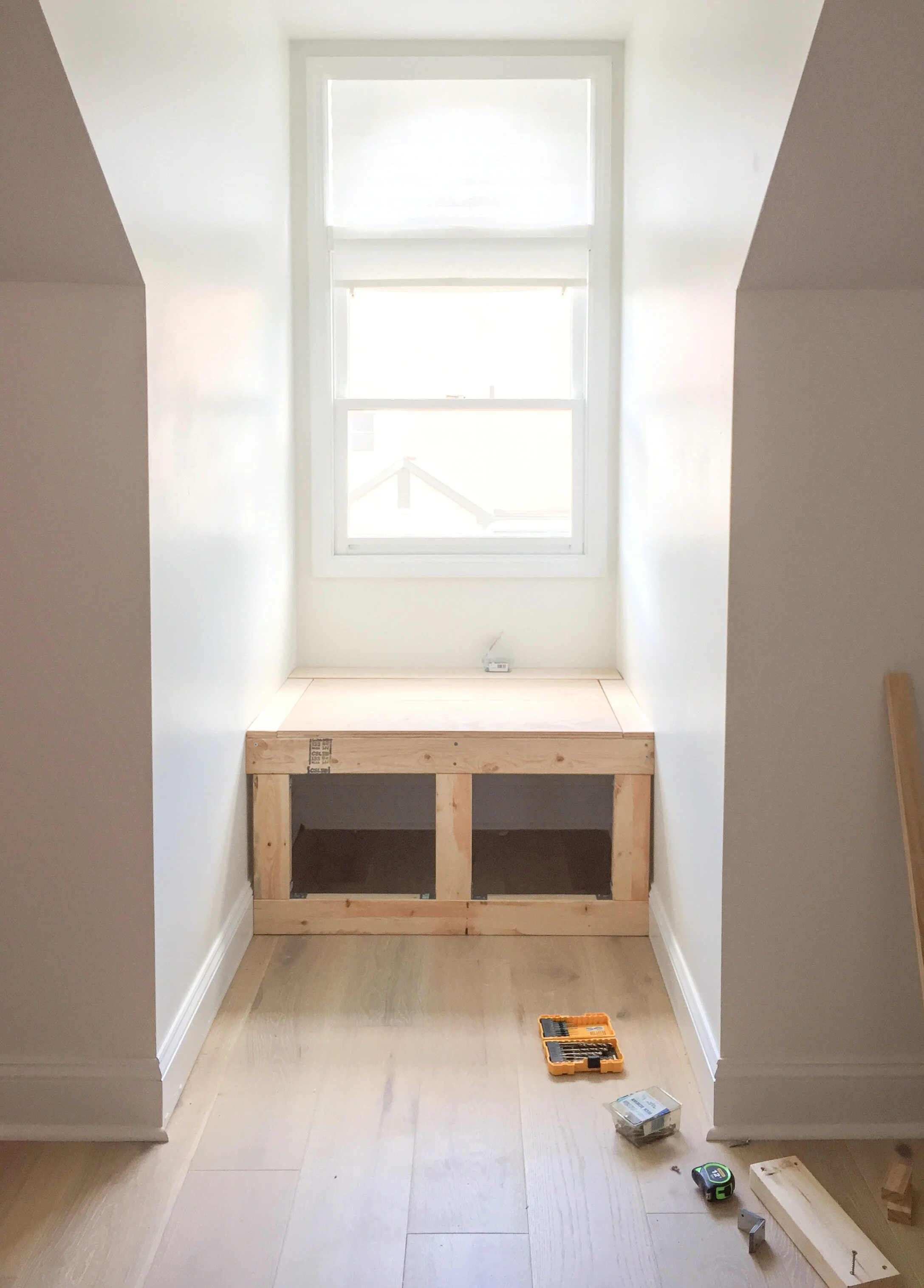
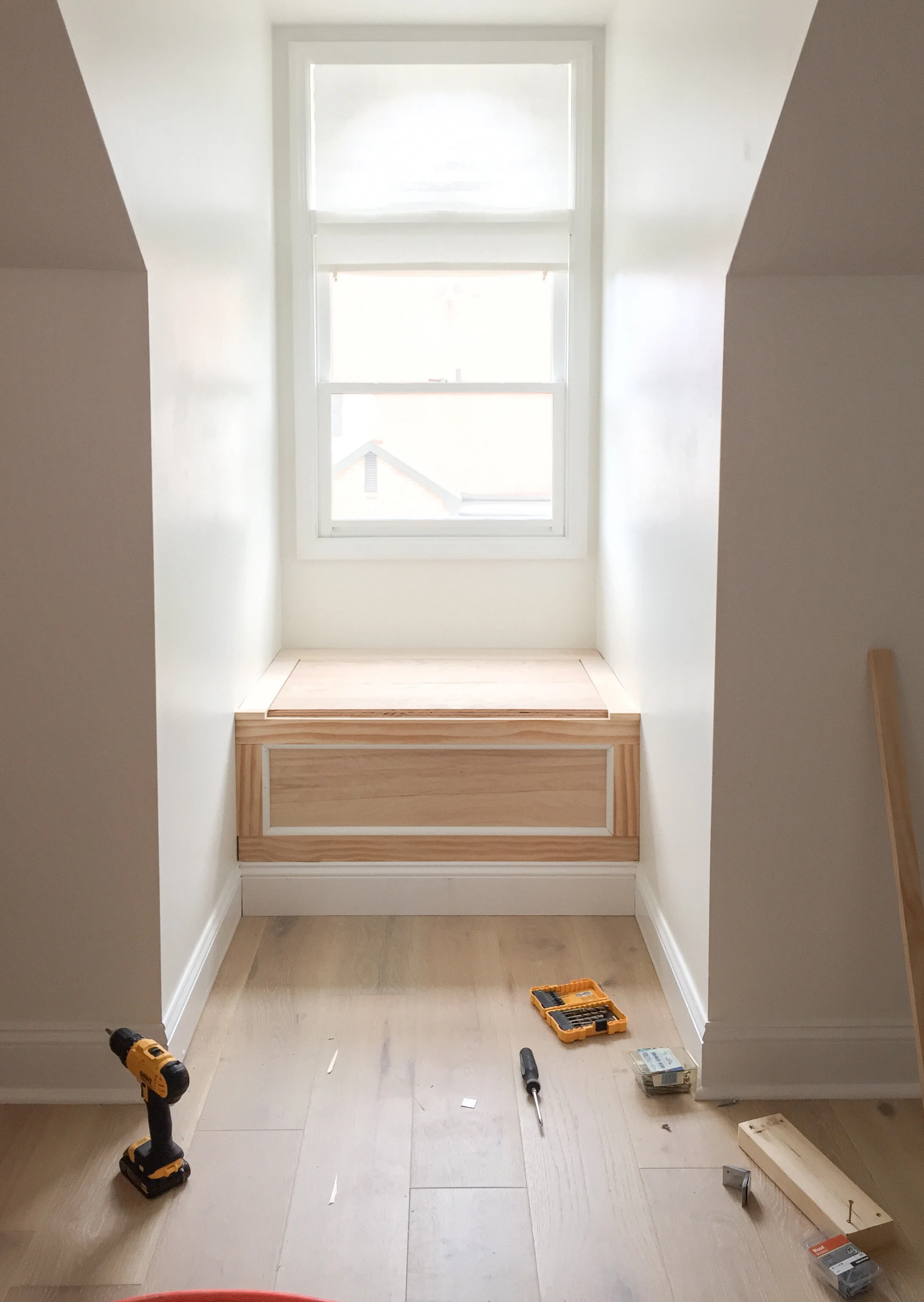
Here are a few mid reno photos. The white paint made such a big difference in this space, and helped the 8ft ceilings to feel higher, especially near the dormer window where they slope down into the knee walls.
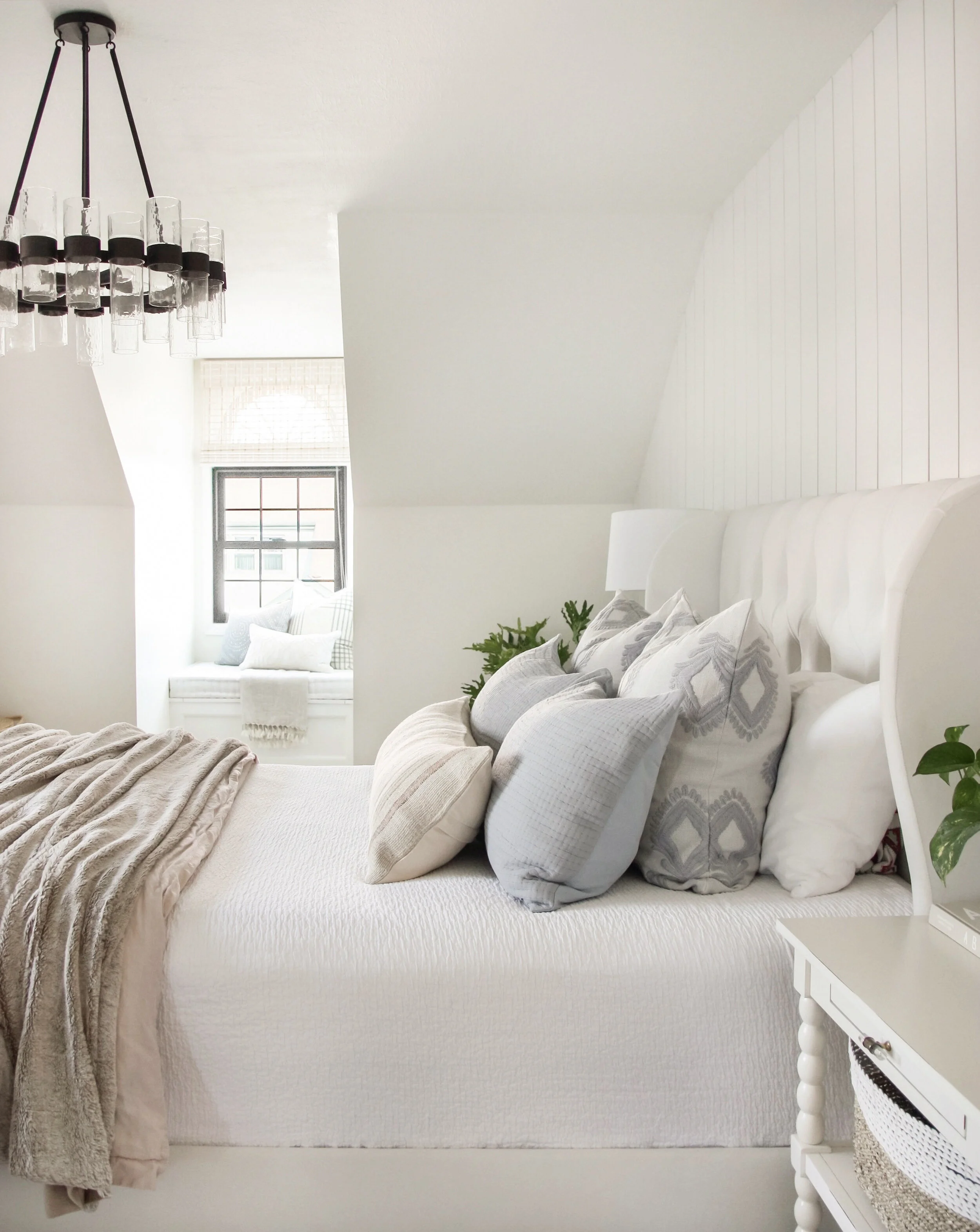
We then installed this light European Oak flooring which also adds to the light and airy feel in this space. To pull more dimension into the all white space, we added in this vertical shiplap accent wall behind the bed last year. We also removed the ceiling fan and replaced it with a chandelier to give the space a more polished feel. We just recently moved the original chandelier to the guest room and upgraded to the Penni Glass Chandelier and the proportions are a bit better for this large space. I love the way the light from the dormer window shines through the bubble glass in this piece and catches your eye as you walk into the space.
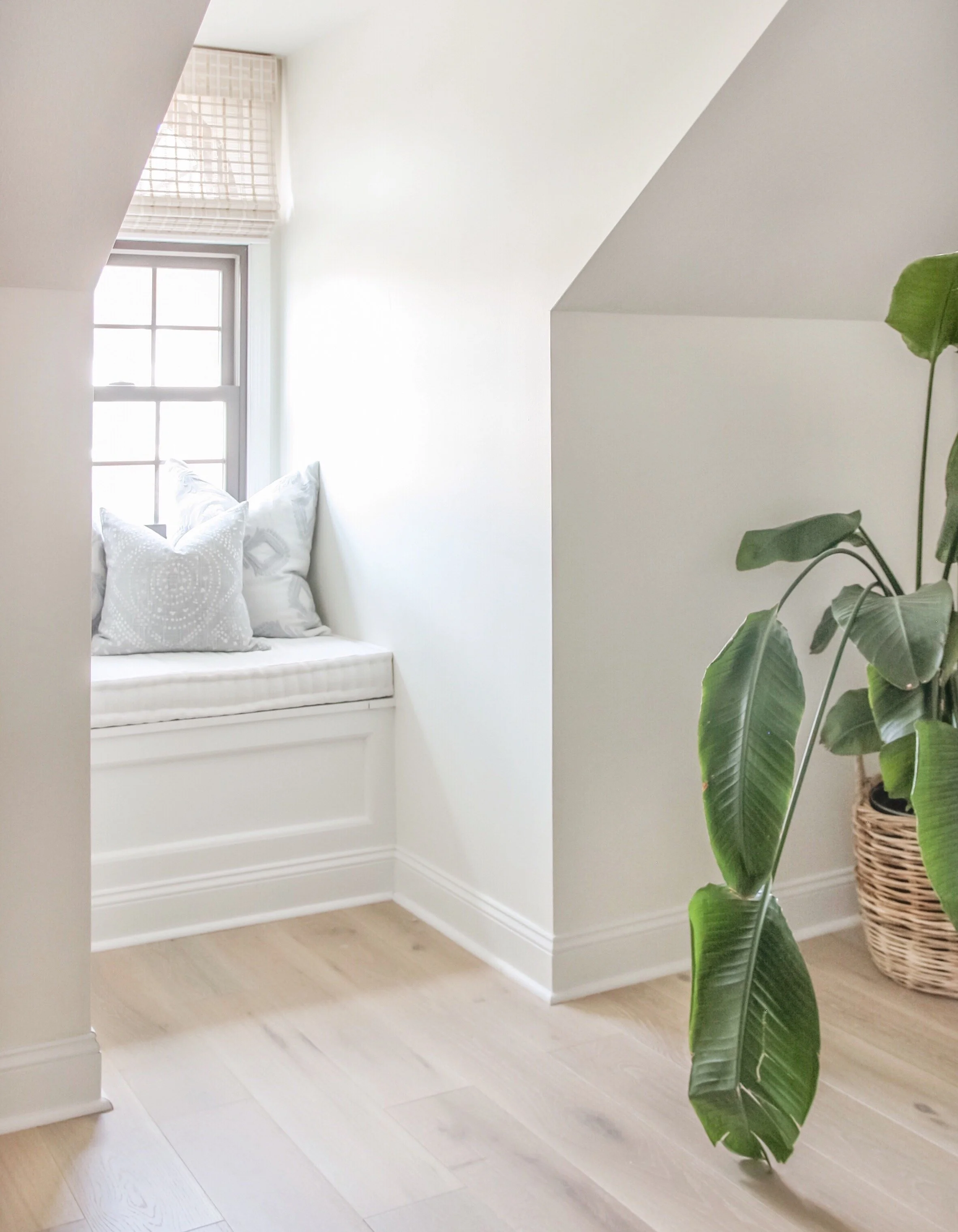
Another addition we made to the space that made a big difference was adding this extra deep window seat into the dormer window. It’s about five feet deep, so we were able to make a super cozy space that gives that area of our room more purpose and adds to the overall relaxing feel in the space.
Overall we are very happy with the way our bedroom has come together over the past few years, and truly enjoy spending time in this space. There are a few more changes I’d like to make in here still—the biggest being a furniture refresh and possibly upgrading to a king size bed. Even if we don’t end up doing anything else in here, I feel grateful to call this space our own. It’s even sweeter to have the fun memories we made while renovating to reflect on every time we walk into the space.
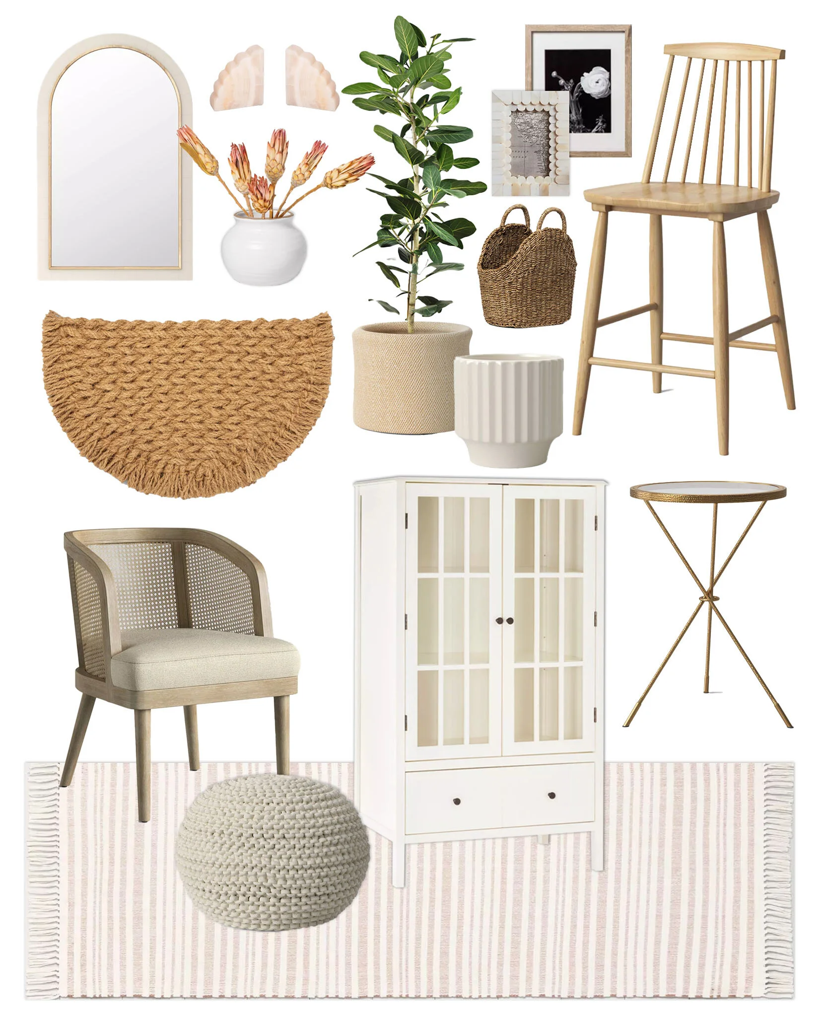
High/Low Design Board: Polished Neutrals
Low:
High:
What I'm Excited to See More of in 2020
Today I thought I’d share a few design elements that I’ve been loving lately, and am looking forward to seeing more of in the coming year. I’m not big on design trends, but I always love watching the design world evolve and seeing what we bring into it each year. The following are elements that I’ve noticed have gained popularity throughout the last year (or more) that I’m loving and hope to continue seeing more of.
Warm Brown Tones
Whether it’s a couple of well placed accessories, or a piece of furniture, I’m really into the warmth that small doses of brown tones introduce into a space. They give the design so much depth and contrast without the starkness that black can sometimes bring.
Via McGee & Co.
Whimsical Floral Arrangements
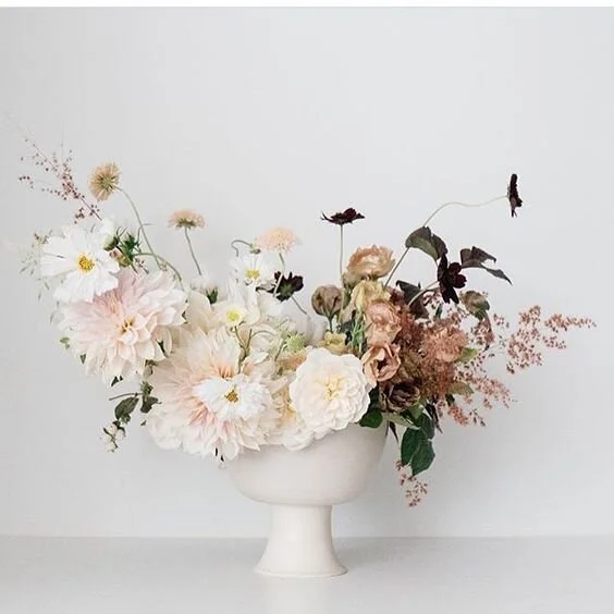
I’ve been loving all of the more natural, wild, and whimsical floral arrangements I’ve been seeing lately, and have started trying to create some on my own. I’ve also been enjoying the muted color palettes in the arrangements along with the traditional pedestal vases that have been becoming more prevalent lately.
Via Jenni Kayne
Via @notary_ceramics
Vintage Art
Vintage art, whether real or faux, really adds so much character to a space. It helps to make a design feel more collected, especially if you’re using a lot of new pieces or your space is lacking in architectural interest.
Natural Wood Tones and Organic Elements
Via Birds and Bobos
Muted, Nature-Inspired Color Palettes
Via Jenni Kayne
Via Cloth & Main
Arches
Via Amber Interiors
Putty colored cabinetry + Natural Marble Countertops
I know that natural marble countertops come with a lot of disclaimers, and aren’t great for, well, a lot of real life, but the beauty of them just cannot be matched. I love the movement and character they add to a space, and they have been the perfect match for the putty colored cabinetry we’ve been seeing lately. I’ve been so drawn to these neutral putty tones, because they still have the light and bright feel of an all white kitchen, but are just a bit softer and add so much warmth.
Via Jenny Komenda
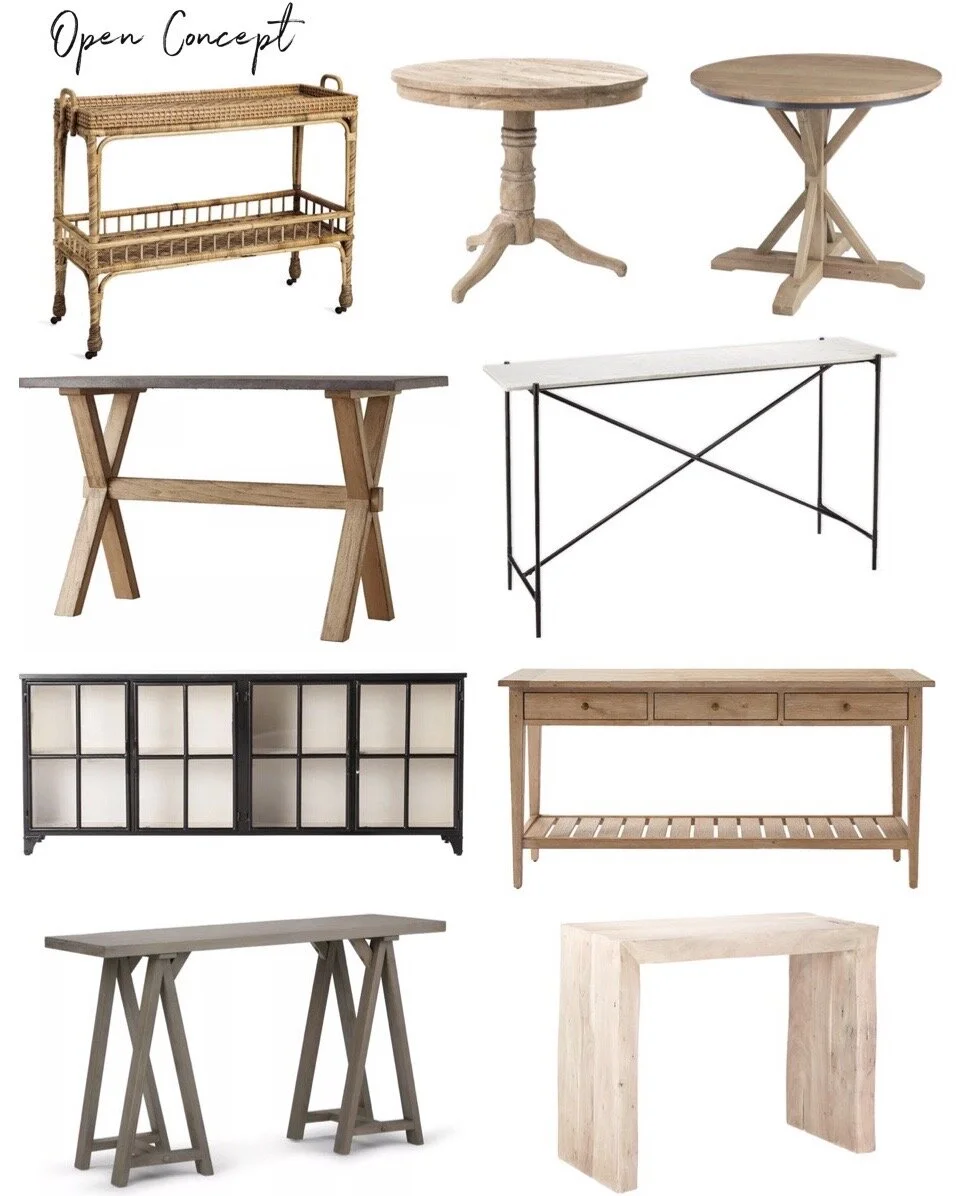
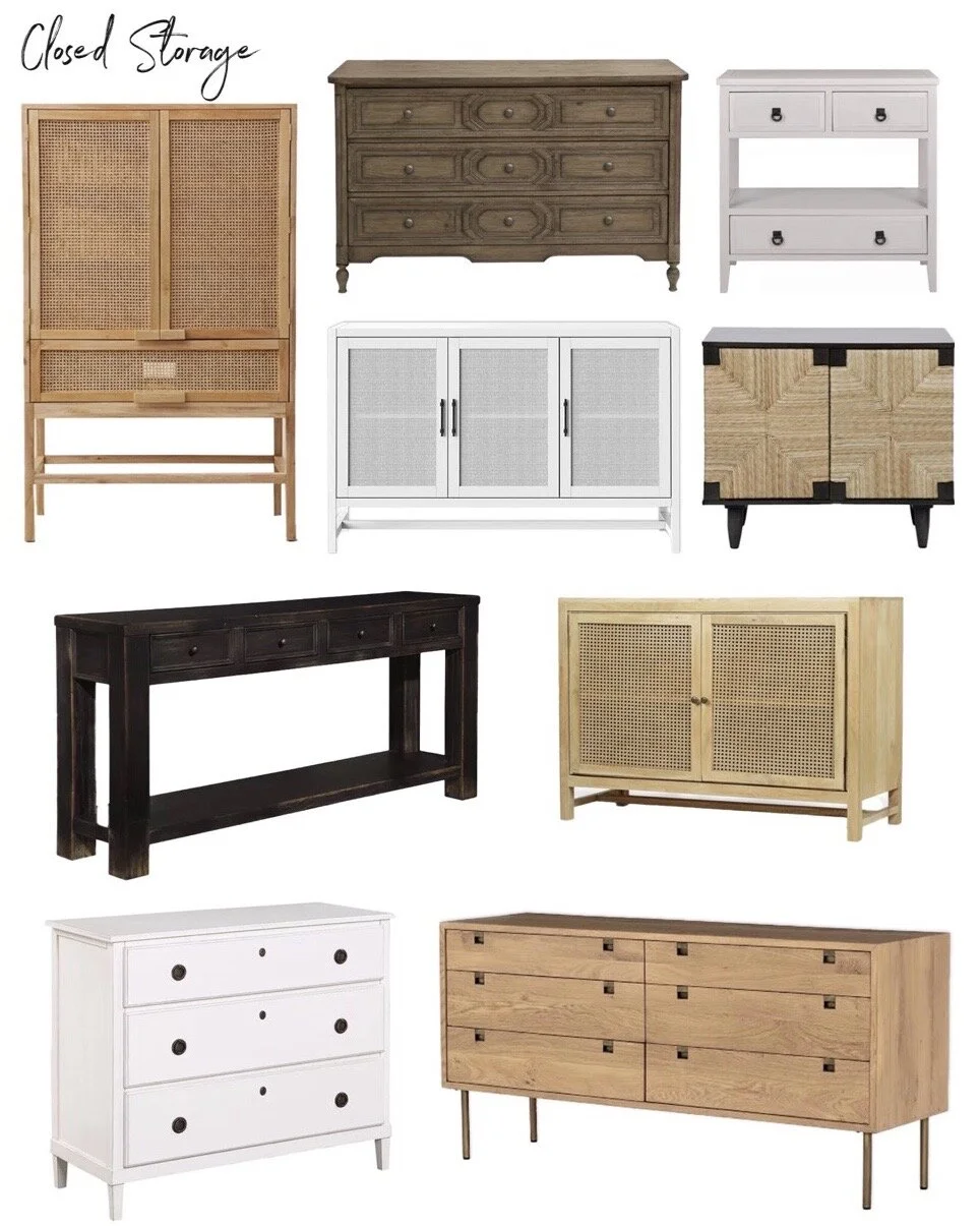
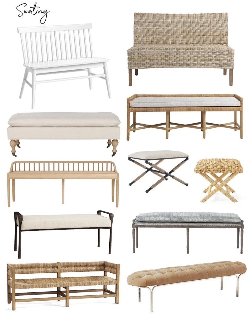
Entryway Furniture Roundup
Entryways are one of my favorite spaces in a home. It’s the first impression guests have when they enter your home, and provides a taste of what they can expect in the rest of the home. At this point, I’ve styled my entryway so many different ways I’ve lost count. I’ve had a couple different benches, a cabinet, and now a bar cart. It’s such a small area I can’t help but constantly edit the space so I can try new things out. Today, I thought I’d share a roundup of some of my favorite entryway furniture pieces, and I’ve grouped them into three categories: open concept, closed storage, and seating. These are some of my all time favorite entryway pieces along with many of my go to’s when sourcing for clients, so I hope you find this helpful if you’re looking to spruce up your entryway!
My Favorite Curtains & Curtain Rods
Today I’m sharing a roundup of some of my favorite curtains and curtain rods. I think they really make such a huge difference in a space, and one of the most frequently asked questions I get is where my curtains are from. I purchased all of my curtains from Homegoods when I came across a brand that I really liked there, and for some reason they happened to have enough to do my entire house! They are a really nice Belgian linen with a cotton lining, and a pinch pleat top. I’m always keeping my eyes peeled for them when I’m shopping online or in store, and recently I saw them pop back in stock (only difference is they don’t have the pinch pleat top) so I thought I’d do a roundup of all my favorite curtains and curtain rods. I hope you find this helpful if you’re on the hunt for curtains and rods! These are my go to’s when I’m sourcing window treatments for client projects, and I highly recommend every piece on these roundups!
Weekend Style: January Kitchen Refresh + Organization
Kitchen Organization

